Two main considerations have a bearing on whether or not color or graphics should be used in a newsletter, and if so, to what extent. The type of newsletter is one, and method of production is the other. The second of these, of course, might be dependent on what in-house devices and expertise are available. Short runs of up to 1000 copies of (let’s say) a four-page realty newsletter, might easily be produced by a small office using a moderate-sized, up-to-date desktop printer—with remarkably professional results. If color is available as an option then the cost of its inclusion might need to be taken into account and any decisions would probably depend on the budget allocation for the project concerned. On the other hand, the same office would have to employ the services of a commercial printer in order to produce 100,000 copies of a sixteen-page community newsletter. Indeed, there are so many different possibilities that each would have to be considered according to whatever variables apply. A free quarterly handout promoting a local tradesman’s business, for example, is a very different publishing proposition to a newsletter covering a specialist topic and distributed to paying subscribers.
Other Things To Consider
Apart from these obvious factors though, what other things should be considered? The first that comes to mind is presentation, or put another way, the overall look of a publication. Most newcomers to the world of newsletter production seem to have an innate belief that inclusion of color and graphics enhances the look of all publications. In truth however, there usually have to be more practical reasons for their inclusion than just decorative effect. Improvements in presentation can be achieved by many methods, such as paper quality, choice of fonts etc. Once the decision is made to include them though, they should be used in such a way as to add to the overall attractiveness of the publication at the same time as achieving the desired objective.
Before making a decision then, about whether to have color and graphics in your newsletter it is always best to ask yourself how their inclusion might enhance it. If they improve clarity and readability then you have good reason for deciding in the affirmative. To be sure that their inclusion will help make such improvements you need to consider the purpose of the newsletter, its readership, frequency of publication etc. Graphics and color are design elements that necessitate looking at the publication as a whole. Consistency is the key to using them effectively and producing a unique style for your newsletter. It is also one of the best ways to improve clarity and readability.
Using Graphics
Graphics, of whatever sort, tend to look best on a page divided into columns. That way the copy can be more easily broken up into readable chunks, especially when the graphics are pictures that illustrate subjects within the copy itself. Captions, when used, are best placed directly underneath the pictures they refer to, to avoid any confusion.
Photographs
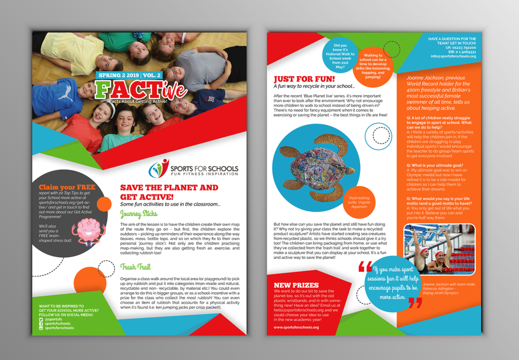
Due to the amount of detail, perceived authenticity, and the fact that they capture a moment in time, photographs can be a useful form of graphic to include in a newsletter. Head and shoulder views (mug shots) have enormous appeal to readers, as do group photos, candid shots (e.g. who was at the office party?), historical material (‘before and after’ pictures of a building, for example), etc. Use a photo editor to crop out any unnecessary detail and possibly to retouch for clarity. If including a number of photographs, crop them to different sizes and shapes for variety. Look carefully at your retouching and cropping results though, to make sure they are not misleading.
Clipart And Line Art
Many newsletters overuse clipart, thinking it’s an easy way to add something ‘extra’. However, there is now so much free material widely available that too much can soon appear tacky. It can be excellent though, for adding humor, particularly when the rules of consistency are observed. Black and white (line) art, on the other hand, is not so common but if you can get hold of some original material, particularly on a regular basis, it can often be made to fit into a newsletter format very well.
Cartoons
Another popular form of humor that almost always go down well. Once again, consistency, especially a theme that is consistently followed, can add hugely to a newsletter’s following. Usually one, or a strip of three is enough for any newsletter.
Puzzles
As with cartoons, puzzles such as crosswords can generate an enthusiastic following among a newsletter’s readership and are always worth trying. Don’t overdo them though. One fairly short and (depending on the reading audience) fairly simple one is usually all that is required.
Diagrams And Charts
These can be useful in most newsletters from time to time. If you layout your newsletter electronically, as most do nowadays, be sure to use a simple formatting program (such as a popular word processor) rather than an obscure format that may cause all sorts of problems in conflict with your other software.
Fonts
Not really graphics, of course, but worth mentioning since some newsletter producers are fond of using outlandish typefaces as a way of illustrating the theme of an article. This is really best avoided. Use one of the methods above, or a clever title perhaps, to make your point.
Using Color
The commonest mistake that people make when printing a newsletter in color is to overdo it. This is understandable. After all, the thinking goes, if I have it, why not flaunt it? Unfortunately, any advantage that might be gained is quickly outweighed by this strategy. Color should be used prudently or its impact is lost. In the case of full color, let photographs have prime placing and avoid competing colors nearby. With spot color, use it to add impact only to the most important elements on the page or according to a consistent style. Also, always use standard colors, rather than special mixes (e.g. plain ‘Blue’ rather than ‘Aquamarine’ or ‘Ice Blue’).
Full Color
Few newsletters use full color printing, the commonest reason being that relatively short runs (compared to most magazines, for example) make it uneconomic. However, if it is an option, it may be worth stressing again that it should always be used with restraint. Subdue any urges you may have to splash color everywhere.
Spot Color
This is best used to achieve standardization in the newsletter style. The layout should always be clean and easy to follow and color-coding can help in this regard. In other words, to make regular features (e.g. ‘Tip Of The Week’, or ‘Your Letters’) easy to locate, surround these items with a colored border, or underline the headings with a colored rule, then stick to this format even if the actual color changes from issue to issue. Avoid colored text if you can, especially in the major headlines, and never ever use it for body text.
Preprinted Color
Colored mastheads can be very effective and one of the best ways is to pre-print a supply of ‘master sheets’. Depending on the print run and configuration of your newsletter, and the amount you have to invest, you may be able to include both the outside front cover (OFC) and the OBC and make large savings at the same time. The master sheets can then be overprinted as required including the addition, if necessary, of a second color.
Paper Color
Don’t overlook this most cost effective way of all to include color in your publication. Be wary though. Make sure you use only light shades or pastel colors or the text may be hard to read. The major drawback to using colored stock is that you really cannot gain any of the advantages of ‘color coding’ mentioned above, except possibly by using a different color for each edition for identification purposes.
Putting It All Together
Stick to a consistent style by creating a template. This predetermines where regular items will be placed, what types of graphics to include, and how colors are to be used. It also establishes a standard layout that will soon become familiar to your regular readers, making them feel more ‘at home’ (at the same time as making your newsletter more readable). This advice, by the way, is equally applicable to electronic newsletters in whatever form they are distributed, except for those produced in plain text (which cannot include graphics or color).